Question: How do you tackle the problem of income inequality?
Answer: Muck about with the graphs.
Compare the following.
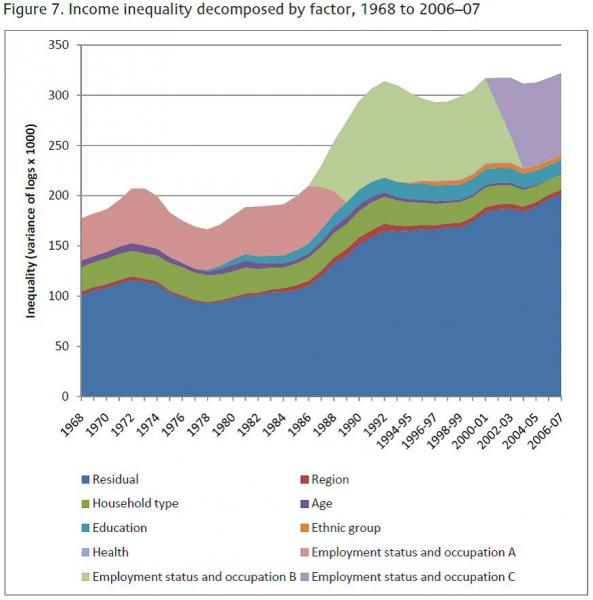
The first graph comes from a report by the Institute for Fiscal Studies (IFS) for the National Equality Panel. It shows trends in income inequality between 1968 and 2007, ‘decomposed’ (or broken down) by various factors.
The second graph comes from the final report of the National Equality Panel, which was published with a fanfare last week. It references the IFS report as the source for its data.
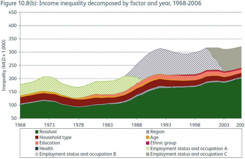
Notice the difference? That’s right. The scale on the second graph has been altered. The x-axis (left to right) has been stretched; the y-axis (up and down) has been squashed. The rather steep rise in the inequality curve shown by the original graph becomes a rather more stately increase in the official government report. The y-axis scale also starts at 50, rather than 0 (as in the original IFS report). This makes the levels of inequality appear less than they actually are.
So far, so usual. Governments of all political persuasions mess around with the figures to give the best spin on an unpalatable story.
Take a closer look at the graphs. They are divided into bands to show the impact of a given factor on the overall rate of inequality. As the official report puts it:
'In these figures, the more that a particular factor contributes to overall inequality… the wider is the band representing it. If the importance of a particular factor declines… the band becomes narrower over time. Conversely, if a factor becomes more important, the band associated with it becomes wider.'
The graph shows us is that employment status, education and ethnicity all became more significant as factors driving inequality. Age declined as a factor, as did household type. But look at the biggest factor driving inequality. It’s labelled ‘residual’. That’s social science code for ‘we don’t know’.
I’ll blog on this matter in more detail when I get the time. For now I would simply observe that the most significant recent government study on the causes of inequality offers no explanation for where most of it comes from.
Update: second blog on this subject is here.